


Stack the deck with Figma Slides


Say goodbye to lackluster presentations. Today, we’re announcing the open beta of Figma Slides, here to set a new standard for telling visual stories.
According to a blog post by Visme:
- 45% of presenters find it difficult to design creative layouts for their presentations.
- 41% of presenters find it challenging to find and use great visuals.
- 47% of presenters take more than eight hours to design their presentations.
Figma Slides is in beta and will be rolling out throughout the day on June 26 PDT.
According to our research, Figma users created about 3.5 million presentations in the last year alone. That’s because it offers something other slide products don’t—the power of high-quality design. When it comes time to present, however, designers have had to go through acrobatics to accommodate non-designers, from porting work into other tools to sending pre-reads to shoehorn in a prototype.
That’s why we built Figma Slides, now in open beta. What started as a scrappy project in an internal hackathon is now a powerful tool that marries the visual fidelity of Figma with the interactive feedback mechanisms of FigJam. Built for both professional designers and non-designer collaborators, Figma Slides is a tool that gets everyone’s buy-in. Whether it’s a product review for executives to green-light a new feature, a sales deck convincing a client to say yes, or a pitch deck for funding from a potential investor, Figma Slides enables you to craft a story that gets people on board.
Delivering on the Figma promise with high-fidelity design tools
As a tradeoff for pixel-level control and the familiarity of their favorite toolkit in Figma, designers have gone without basic slide functionalities like speaker notes and slide transitions. Figma Slides not only addresses those core features, but amplifies design functionality, making it easier for both designers and non-designers to co-create in the same space.

Toggle on design mode
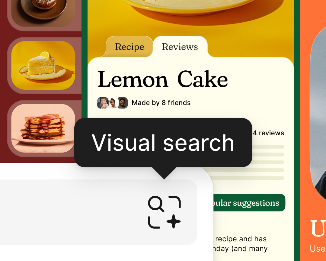
According to this TechSmith study, 97% of respondents who use images in their communications say visuals make their messages more effective, and 64% say they increase engagement and attention.
While the basic toolbar has everything you need to kick off a presentation with text, images, and shapes, designers can toggle on design mode to have the full capabilities of Figma at their disposal. From Auto Layout to advanced properties, everything you expect from Figma Design is accessible in Figma Slides.
“Every feature that’s optimized for UI design, like the way things snap into alignment, add up to a huge quality-of-life improvement,” says my colleague and product designer Keeyen Yeo. “For example, when I paste an interactive component with a hover state, it comes to life when I present.”
Keep libraries and assets at your fingertips
Designers on our platform have spent years honing their text styles, color styles, and assets in Figma. Fortunately, these same resources are just one click away in Figma Slides. Plus, to anyone who has gone to the painstaking trouble of exporting UI designs one by one for a presentation, our seamless, copy-paste workflow now scales across the entire Figma suite of products.
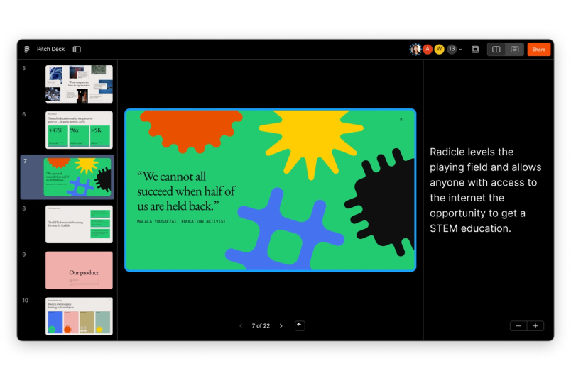
Get the big picture with grid view
Impactful visuals are just one part of the equation; threading them through a compelling narrative is another. Choose to work in single slide view, or edit in grid view to get the bigger picture. Zooming out organizes slide sections in clear rows so that you can easily rearrange as you tighten the narrative, and changes are reflected when you jump between views.
“When you have more than 20 slides in a deck, changing your story arc gets much harder, so people tend to stick to what they’ve built out so far,” says Keeyen. “With grid view, you get a bird’s-eye view that empowers you to massage the overall narrative.”
Turning one-way presentations into two-way conversations
Coincidentally, it was FigJam that helped expose the inefficiency of presentations today. Once we launched it in 2021, we used it for virtually every meeting. Team kickoff? FigJam. Bug bash? FigJam. Exec product review, all hands, Q&A? That’s right—FigJam.
We love FigJam because it allows 20 people to voice their opinion in the time it usually takes one person to speak. Suddenly, it isn’t just the loudest or most senior person who can sway the conversation; the dialogue becomes much more democratic. Broadening the conversation means getting to a decision faster. There’s no reason why presentations should be any different.
Get contextualized feedback with polls and alignment scales
It’s an all-too-familiar scenario, says Christa Simon, my colleague and user researcher: Either the presenter “gets a bunch of head nods and feels like they’re talking to a wall,” or they get overwhelmed with feedback that seeps in through conversation, meeting notes, the chat box, and other channels. In all cases, the upshot is unclear.

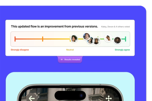


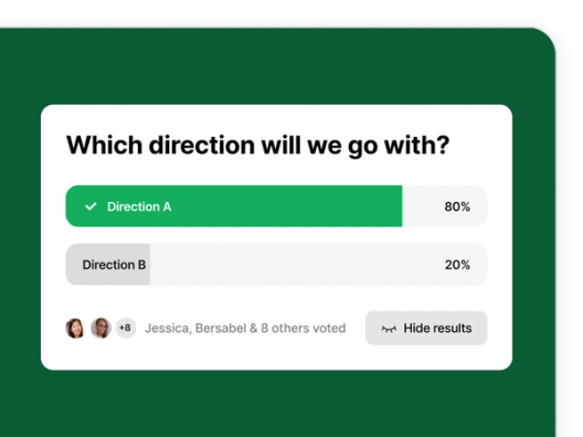
With Figma Slides, polls and alignment scales not only streamline the flow of information, but also capture and contextualize that feedback. This means presenters don’t have to sift through different channels after the fact, and those who are catching up from a missed meeting have a source of truth to reference. For example, team members can stamp their faces to indicate agreement—or simply signal that they’ve read a slide in an async review. With the ability to drive engagement, take pulse checks, and weigh decisions, it’s much easier to find a path forward.
Immerse your audience with embedded prototypes and animated transitions
A prototype is worth a thousand words. Previously, teams would have to hack together a workflow to bring a design to life—creating the context in another tool, then queuing up a tab for a prototype in Figma Design. Or, they would include a link in the slide but risk losing control of the narrative and have people jump ahead. Now, there’s no need to toggle between decks and design files.
Plus, with built-in slide transitions like smart animate and push and dissolve effects, designers can easily smooth the joinery between slides and keep the work moving.
Co-present seamlessly
You’ve heard the refrain: “Next slide. Next slide. Next slide.” It’s often the case that multiple team members are lined up to present, but having a single person in charge of driving can be cumbersome or awkward. Figma Slides allows co-presenters to spotlight themselves when they’re speaking and to pass the baton when it’s time.
Bringing all hands on deck
In the past, slide tools have made teams decide between a powerful toolkit that may alienate the non-designer and a simpler interface that prohibits high-fidelity expression. Both needs are valid, which is why we made Figma Slides with both use cases in mind. Co-creating a story that gets your desired outcome is not easy, so we've built a shared space for the entire team—not just designers—to brainstorm, riff on ideas, and build out effective presentations.
Use AI to tweak the text

See what other AI features we’re launching at Config 2024 in our recap.
We wanted to make AI accessible to everyone, so we added a feature that makes it easy to riff on text. From shortening the copy, to adjusting the tone, to translating what you’ve written, AI helps you craft the perfect message for your audience.
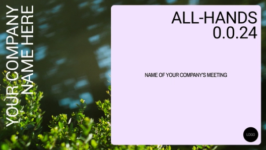
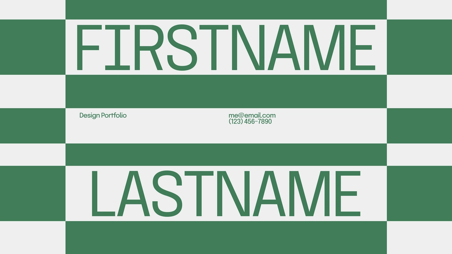
Choose existing templates and add your own
Everyone knows the power of a well-crafted deck, but non-designers are reluctant to ask their design counterparts to put in the final polish. As Christa tells me, “They think, ‘I’m embarrassed, but I need to make my presentation feel polished and up-to-date.’ There was a negative cloud over the whole experience.”
Whether it's keynote presentations or pitch decks, teams can choose from preexisting, best-in-class templates tailored to their specific needs. They can also publish any deck as a template for their collaborators to pull from. On top of that, these templates don’t break down. “Usually, when you hand off a template to a less design-savvy person, you’re still putting the burden on them to adjust alignment and spacing as they add content,” says Keeyen. “Templates in Figma Slides are spatially aware with Auto Layout, so when you start typing, things reflow nicely.”


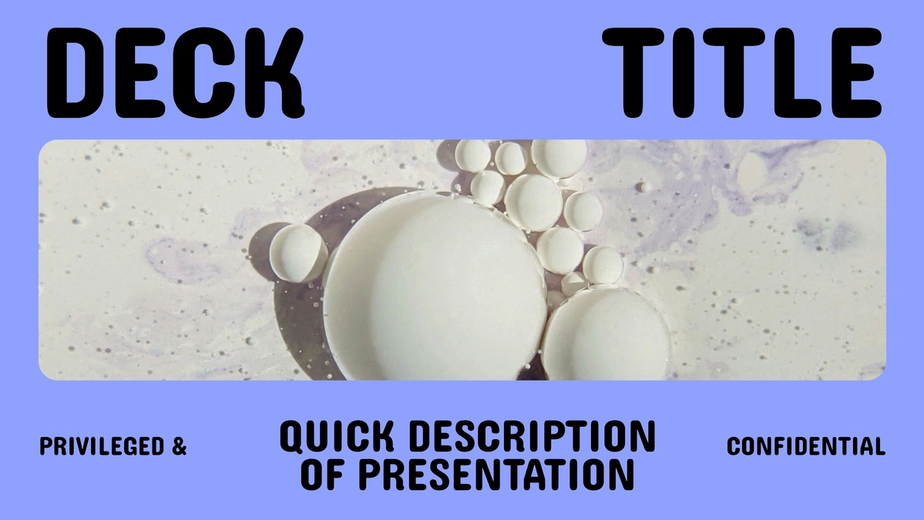
Mix and match the slides you need
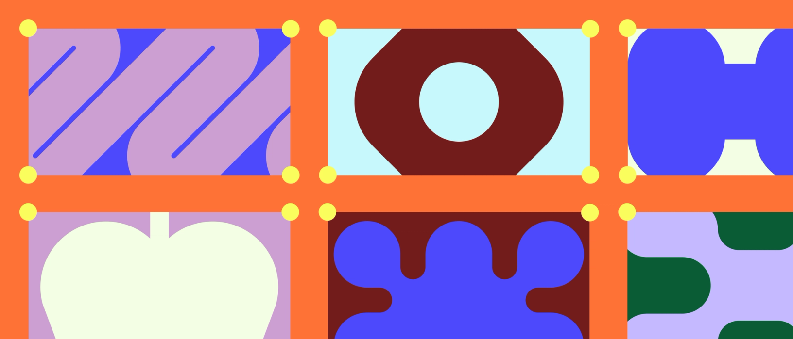
Have you ever watched a designer present a stunning deck and thought: I want to steal that style? Well, now you can. “People quilt together templates based on portions of other presentations,” says Christa. “They’ll remember a top banner from one slide, and a great graph from another.” With Figma Slides, you can pull individual slides from a variety of templates, then choose a unifying theme to apply to the whole deck so it looks cohesive.
Get started with Figma Slides
When it comes down to it, collaboration and storytelling are crucial for moving work forward. We see Figma Slides as filling a critical gap in truly building in a shared space. As Keeyen says, “Everyone can get a taste of the joy designers have had making decks in Figma all these years.”
Figma Slides is in free beta. Starting in early 2025, it will be available on free and paid plans, starting at $3 and $5 per user/per month. Watch our tutorial and visit our help center to learn more, and start exploring this curated collection of templates created by the Figma community.